2025
Breakthrough Advertising
This rebrand became a turning point, a deliberate departure from Relentless to Breakthrough Advertising.
Full Brand
Website
The Redesign
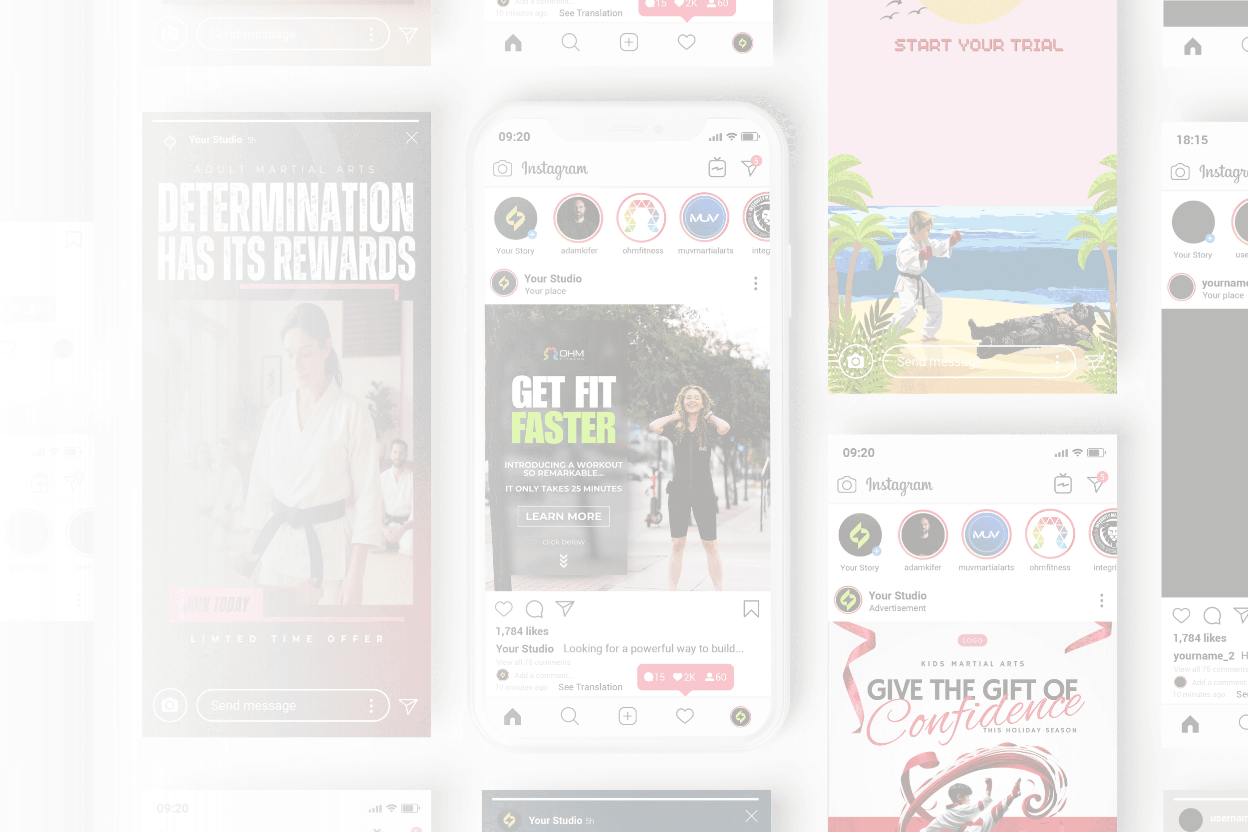
The rebrand of Relentless Media Agency into Breakthrough Advertising was a full-scale creative evolution; redefining its identity, language, and digital presence into a brand that embodies precision, authority, and clarity.°
The Evolution of an Agency
This project marked the rebirth of Relentless Media Agency into Breakthrough Advertising, a complete identity shift designed to match the agency’s new direction, voice, and ambition. The goal was more than a new name; it was about shedding old skin and stepping into alignment with the founder’s next era. Under Adam Kifer’s leadership, the agency evolved from hustle-driven marketing to a refined, strategic ecosystem built for long-term growth.
The Challenge
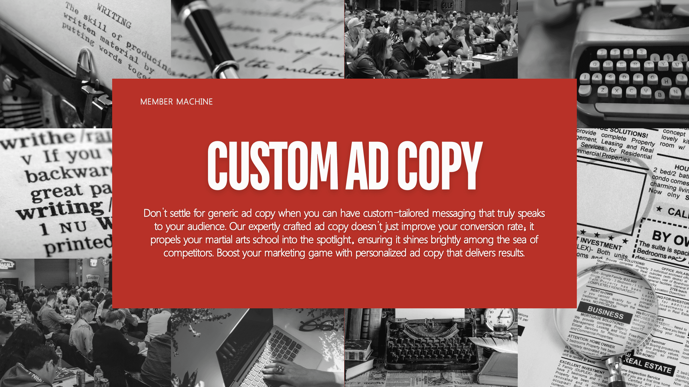
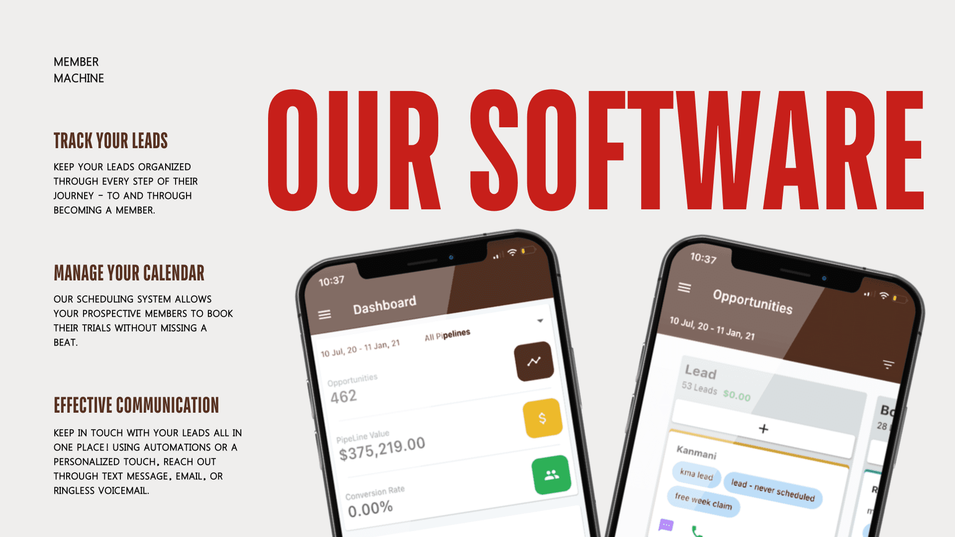
Rebranding an existing agency meant honoring its results while transforming its personality. The old look carried weight but also the residue of the past. My task was to rebuild trust visually and verbally: clean, bold typography, a color system rooted in strength and precision, and messaging that sounded confident yet human.
The new visual system embodies authority and clarity, deep browns and blacks for grounding, scarlet for urgency, and eggshell tones for contrast and control. Every texture, layout, and frame was chosen to feel high-end and purpose-driven. The result is a visual identity that radiates confidence without ego, designed to speak directly to entrepreneurs who lead with action.


The Voice
The rebrand of Breakthrough Advertising° wasn’t just a visual overhaul; it was a reclamation of identity, transforming a relentless past into a focused, future-facing brand built on strength, strategy, and truth.
Adam Kifer restructured all brand language to reflect leadership, transparency, and measurable results. No fluff, no corporate filler; just direct, data-backed storytelling with human warmth. Breakthrough’s voice became a balance of marketing precision and mentorship, a language that builds trust instantly.
The Transformation
Every element of the rebrand, from the color psychology to the copy, was designed to embody evolution itself
This rebrand positioned Breakthrough Advertising as the standard-bearer in martial arts and fitness marketing, a brand with clarity, class, and credibility. The new website, strategy decks, and collateral turned their vision into a scalable identity that commands respect online and in every pitch. I’m deeply grateful to Adam Kifer for trusting me to lead this creative evolution and for allowing me to craft a brand worthy of its name, Breakthrough Advertising.

More Works
(GQ® — 02)
©2024


FAQ
01
What is working with Ahri Studio like?
02
What kind of results can I expect?
03
What makes Ahri Studio different?
04
How do I know if this is right for me?
2025
Breakthrough Advertising
This rebrand became a turning point, a deliberate departure from Relentless to Breakthrough Advertising.
Full Brand
Website
The Redesign
The rebrand of Relentless Media Agency into Breakthrough Advertising was a full-scale creative evolution; redefining its identity, language, and digital presence into a brand that embodies precision, authority, and clarity.°
The Evolution of an Agency
This project marked the rebirth of Relentless Media Agency into Breakthrough Advertising, a complete identity shift designed to match the agency’s new direction, voice, and ambition. The goal was more than a new name; it was about shedding old skin and stepping into alignment with the founder’s next era. Under Adam Kifer’s leadership, the agency evolved from hustle-driven marketing to a refined, strategic ecosystem built for long-term growth.
The Challenge
Rebranding an existing agency meant honoring its results while transforming its personality. The old look carried weight but also the residue of the past. My task was to rebuild trust visually and verbally: clean, bold typography, a color system rooted in strength and precision, and messaging that sounded confident yet human.
The new visual system embodies authority and clarity, deep browns and blacks for grounding, scarlet for urgency, and eggshell tones for contrast and control. Every texture, layout, and frame was chosen to feel high-end and purpose-driven. The result is a visual identity that radiates confidence without ego, designed to speak directly to entrepreneurs who lead with action.
The Voice
The rebrand of Breakthrough Advertising° wasn’t just a visual overhaul; it was a reclamation of identity, transforming a relentless past into a focused, future-facing brand built on strength, strategy, and truth.
Adam Kifer restructured all brand language to reflect leadership, transparency, and measurable results. No fluff, no corporate filler; just direct, data-backed storytelling with human warmth. Breakthrough’s voice became a balance of marketing precision and mentorship, a language that builds trust instantly.
The Transformation
Every element of the rebrand, from the color psychology to the copy, was designed to embody evolution itself
This rebrand positioned Breakthrough Advertising as the standard-bearer in martial arts and fitness marketing, a brand with clarity, class, and credibility. The new website, strategy decks, and collateral turned their vision into a scalable identity that commands respect online and in every pitch. I’m deeply grateful to Adam Kifer for trusting me to lead this creative evolution and for allowing me to craft a brand worthy of its name, Breakthrough Advertising.
More Works
(GQ® — 02)
©2024
FAQ
01
What is working with Ahri Studio like?
02
What kind of results can I expect?
03
What makes Ahri Studio different?
04
How do I know if this is right for me?
2025
Breakthrough Advertising
This rebrand became a turning point, a deliberate departure from Relentless to Breakthrough Advertising.
Full Brand
Website
The Redesign
The rebrand of Relentless Media Agency into Breakthrough Advertising was a full-scale creative evolution; redefining its identity, language, and digital presence into a brand that embodies precision, authority, and clarity.°
The Evolution of an Agency
This project marked the rebirth of Relentless Media Agency into Breakthrough Advertising, a complete identity shift designed to match the agency’s new direction, voice, and ambition. The goal was more than a new name; it was about shedding old skin and stepping into alignment with the founder’s next era. Under Adam Kifer’s leadership, the agency evolved from hustle-driven marketing to a refined, strategic ecosystem built for long-term growth.
The Challenge
Rebranding an existing agency meant honoring its results while transforming its personality. The old look carried weight but also the residue of the past. My task was to rebuild trust visually and verbally: clean, bold typography, a color system rooted in strength and precision, and messaging that sounded confident yet human.
The new visual system embodies authority and clarity, deep browns and blacks for grounding, scarlet for urgency, and eggshell tones for contrast and control. Every texture, layout, and frame was chosen to feel high-end and purpose-driven. The result is a visual identity that radiates confidence without ego, designed to speak directly to entrepreneurs who lead with action.
The Voice
The rebrand of Breakthrough Advertising° wasn’t just a visual overhaul; it was a reclamation of identity, transforming a relentless past into a focused, future-facing brand built on strength, strategy, and truth.
Adam Kifer restructured all brand language to reflect leadership, transparency, and measurable results. No fluff, no corporate filler; just direct, data-backed storytelling with human warmth. Breakthrough’s voice became a balance of marketing precision and mentorship, a language that builds trust instantly.
The Transformation
Every element of the rebrand, from the color psychology to the copy, was designed to embody evolution itself
This rebrand positioned Breakthrough Advertising as the standard-bearer in martial arts and fitness marketing, a brand with clarity, class, and credibility. The new website, strategy decks, and collateral turned their vision into a scalable identity that commands respect online and in every pitch. I’m deeply grateful to Adam Kifer for trusting me to lead this creative evolution and for allowing me to craft a brand worthy of its name, Breakthrough Advertising.
More Works
©2024
FAQ
What is working with Ahri Studio like?
What kind of results can I expect?
What makes Ahri Studio different?
How do I know if this is right for me?