
2025
OHM Fitness Brand Guideline
A reimagined identity system for the nation’s first EMS-powered fitness franchise.
OHM Fitness
Brand Guideline
The Execution
OHM's Brand is the proof that when strategy and soul align, a brand stops communicating and starts conducting energy.°
Recharging the Future of Fitness
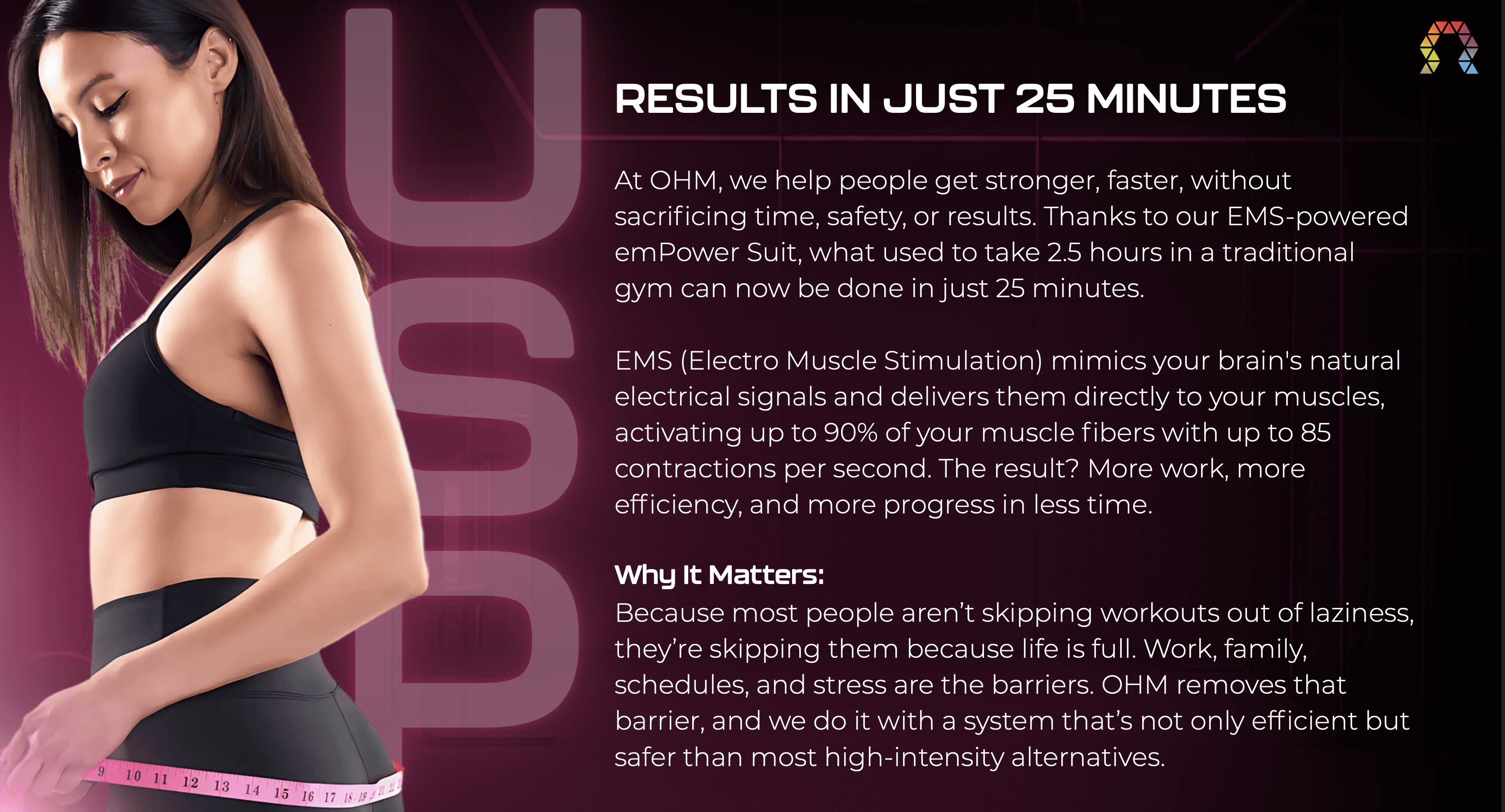
OHM Fitness approached me with an ambitious mission: to reshape how people see time, energy, and movement. Their concept of a 25-minute EMS-powered workout was revolutionary, but the brand language lacked the same precision as its technology. My task was to transform a raw framework into a cohesive identity system that felt human, electric, and alive.
Turning Data into Energy
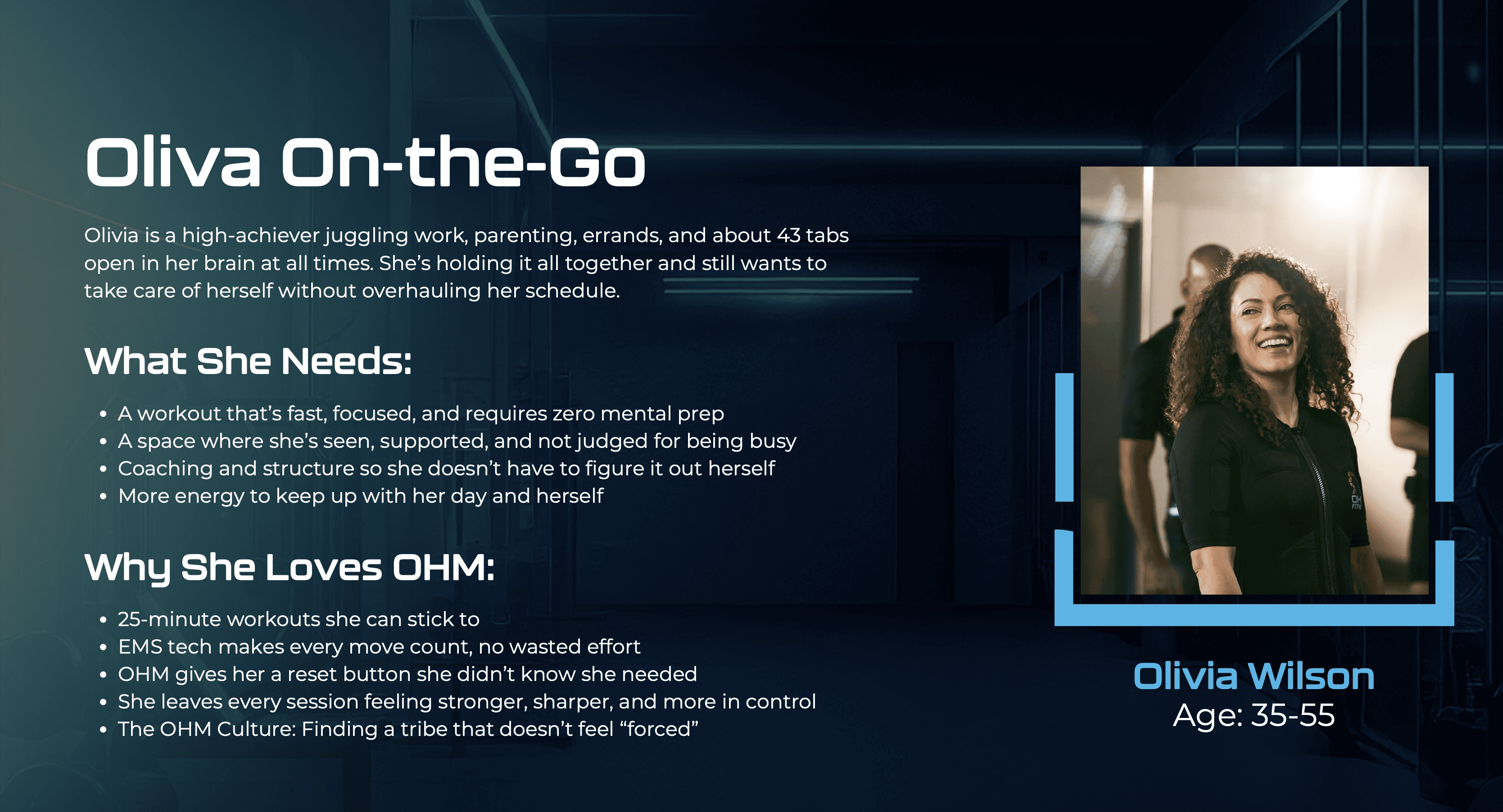
The foundation was full of information: science, structure, and stats. It needed rhythm. I received the copy down to its essence and gave visuals to it as storytelling: intelligent yet approachable, bold yet inclusive. Every word was designed to translate the feeling of the workout into a voice people could connect with instantly.
The visual system followed the body’s own logic: tension, release, and flow. I paired brand typography with dynamic spacing and an electric color arc that mirrors muscle activation. Each spread was crafted to flow like breath: a delicate balance between clarity and charge.


Setting a New Standard
Beyond the visuals, I built the emotional architecture, a brand voice that motivates without shouting and teaches without preaching. It became OHM’s frequency: confident, science-minded, and encouraging by nature. This tone now echoes across every studio, post, and conversation.
What began as fragmented messaging became a 50-page brand ecosystem; part manual, part movement. The new OHM guideline doesn’t just instruct; it inspires. It unites every franchise under one current of energy, proving that design, when charged with intention, can quite literally move people.
Design & Movement
Design isn’t just how OHM looks; it’s how it moves through people.
Since its release, the OHM Brand Guideline has become a touchstone for innovation in the fitness space, not just because of its clarity, but because of its feeling. The system I built gave every franchise, designer, and coach a shared visual language rooted in energy and intention. It’s more than a guidebook; it’s a framework that future-proofs the brand while keeping its human pulse alive.

More Works
(GQ® — 02)
©2024


FAQ
01
What is working with Ahri Studio like?
02
What kind of results can I expect?
03
What makes Ahri Studio different?
04
How do I know if this is right for me?
2025
OHM Fitness Brand Guideline
A reimagined identity system for the nation’s first EMS-powered fitness franchise.
OHM Fitness
Brand Guideline
The Execution
OHM's Brand is the proof that when strategy and soul align, a brand stops communicating and starts conducting energy.°
Recharging the Future of Fitness
OHM Fitness approached me with an ambitious mission: to reshape how people see time, energy, and movement. Their concept of a 25-minute EMS-powered workout was revolutionary, but the brand language lacked the same precision as its technology. My task was to transform a raw framework into a cohesive identity system that felt human, electric, and alive.
Turning Data into Energy
The foundation was full of information: science, structure, and stats. It needed rhythm. I received the copy down to its essence and gave visuals to it as storytelling: intelligent yet approachable, bold yet inclusive. Every word was designed to translate the feeling of the workout into a voice people could connect with instantly.
The visual system followed the body’s own logic: tension, release, and flow. I paired brand typography with dynamic spacing and an electric color arc that mirrors muscle activation. Each spread was crafted to flow like breath: a delicate balance between clarity and charge.
Setting a New Standard
Beyond the visuals, I built the emotional architecture, a brand voice that motivates without shouting and teaches without preaching. It became OHM’s frequency: confident, science-minded, and encouraging by nature. This tone now echoes across every studio, post, and conversation.
What began as fragmented messaging became a 50-page brand ecosystem; part manual, part movement. The new OHM guideline doesn’t just instruct; it inspires. It unites every franchise under one current of energy, proving that design, when charged with intention, can quite literally move people.
Design & Movement
Design isn’t just how OHM looks; it’s how it moves through people.
Since its release, the OHM Brand Guideline has become a touchstone for innovation in the fitness space, not just because of its clarity, but because of its feeling. The system I built gave every franchise, designer, and coach a shared visual language rooted in energy and intention. It’s more than a guidebook; it’s a framework that future-proofs the brand while keeping its human pulse alive.
More Works
(GQ® — 02)
©2024
FAQ
01
What is working with Ahri Studio like?
02
What kind of results can I expect?
03
What makes Ahri Studio different?
04
How do I know if this is right for me?
2025
OHM Fitness Brand Guideline
A reimagined identity system for the nation’s first EMS-powered fitness franchise.
OHM Fitness
Brand Guideline
The Execution
OHM's Brand is the proof that when strategy and soul align, a brand stops communicating and starts conducting energy.°
Recharging the Future of Fitness
OHM Fitness approached me with an ambitious mission: to reshape how people see time, energy, and movement. Their concept of a 25-minute EMS-powered workout was revolutionary, but the brand language lacked the same precision as its technology. My task was to transform a raw framework into a cohesive identity system that felt human, electric, and alive.
Turning Data into Energy
The foundation was full of information: science, structure, and stats. It needed rhythm. I received the copy down to its essence and gave visuals to it as storytelling: intelligent yet approachable, bold yet inclusive. Every word was designed to translate the feeling of the workout into a voice people could connect with instantly.
The visual system followed the body’s own logic: tension, release, and flow. I paired brand typography with dynamic spacing and an electric color arc that mirrors muscle activation. Each spread was crafted to flow like breath: a delicate balance between clarity and charge.
Setting a New Standard
Beyond the visuals, I built the emotional architecture, a brand voice that motivates without shouting and teaches without preaching. It became OHM’s frequency: confident, science-minded, and encouraging by nature. This tone now echoes across every studio, post, and conversation.
What began as fragmented messaging became a 50-page brand ecosystem; part manual, part movement. The new OHM guideline doesn’t just instruct; it inspires. It unites every franchise under one current of energy, proving that design, when charged with intention, can quite literally move people.
Design & Movement
Design isn’t just how OHM looks; it’s how it moves through people.
Since its release, the OHM Brand Guideline has become a touchstone for innovation in the fitness space, not just because of its clarity, but because of its feeling. The system I built gave every franchise, designer, and coach a shared visual language rooted in energy and intention. It’s more than a guidebook; it’s a framework that future-proofs the brand while keeping its human pulse alive.
More Works
©2024
FAQ
What is working with Ahri Studio like?
What kind of results can I expect?
What makes Ahri Studio different?
How do I know if this is right for me?